Page visualization components
Overview
Page visualization components are custom tags an admin embeds in a page's content to build dashboards and entity views.
Authoring syntax
A page stores raw content as HTML. Components appear as XML-style tags, such as <BarChart property="country" />. Every attribute value arrives as a string, so boolean values use "true" or "false" and structured values use JSON strings.
Two tags declare data without rendering anything: <Dataset> and <Query>.
All other tags render UI that reads from a declared dataset by name.
A component's property attribute takes the property's internal name,
not its display label.
Uwazi forms the internal name by replacing each non-alphanumeric character in
the label with an underscore and lower-casing the result.
The label Select group becomes select_group.
A few legacy components use brace syntax, such as {media}(url), instead of an XML tag. Brace syntax doesn't rely on Markdown formatting, so it keeps working on HTML pages. The catalogue marks each legacy component.
Data declaration tags
These tags fetch data and render nothing.
Other components read their results by name.
Dataset
<Dataset> declares a library search.
Uwazi stores the result under name and forces limit to 0,
so the result holds aggregations rather than full rows.
| Attribute | Required | Default | Description |
|---|---|---|---|
name | No | default | Key that other components reference. |
url | No | — | Library URL with a rison-encoded q parameter. |
entity | No | — | A sharedId that fetches one entity instead of a search. |
geolocation | No | false | A truthy value fetches geolocation rows for <Map>. |
The url and entity attributes are mutually exclusive.
A bare <Dataset /> with no url fetches aggregations for every property across all published entities. It adds allAggregations automatically. A url query doesn't, so a custom query needs allAggregations:!t to feed the charts.
A bare <Dataset /> excludes unpublished entities. To aggregate drafts, add includeUnpublished:!t to the query, as in url="/library/?q=(allAggregations:!t,includeUnpublished:!t)". Unpublished entities never appear to anonymous visitors, whatever the query holds.
Examples:
<Dataset />
<Dataset url="a-valid-libray-url" name="dataset1" />
<Dataset entity="entityId" name="entityDataset" />
<Dataset name="dataset2" geolocation="true" />
Query
<Query> declares a call to any internal API endpoint
and stores the raw response under name.
| Attribute | Required | Default | Description |
|---|---|---|---|
name | No | default | Key that holds the response. |
url | Yes | — | Any API endpoint path. |
Example:
<Query url="users?_id=23234324" name="customQuery" />
Chart components
These components render charts.
<BarChart>, <PieChart>,
and <ListChart> read an aggregation from a dataset.
<FreeBarChart> reads inline JSON instead.
Each aggregation chart reads a dataset declared on the same HTML page.
When the dataset attribute is absent,
the chart reads the dataset named default.
The chart shows the loading animation until that dataset exists and resolves.
For the aggregation charts, the property names a metadata property,
or a built-in aggregation.
_types groups entities by template, so its bucket keys are template IDs.
_published groups entities by their published state,
with the keys true and false.
These built-in keys also work in <Counter>.
They don't apply to <FreeBarChart>, <Map>, <Value>, or <GaugeChart>,
which read inline JSON, rows, or metadata instead of aggregations.
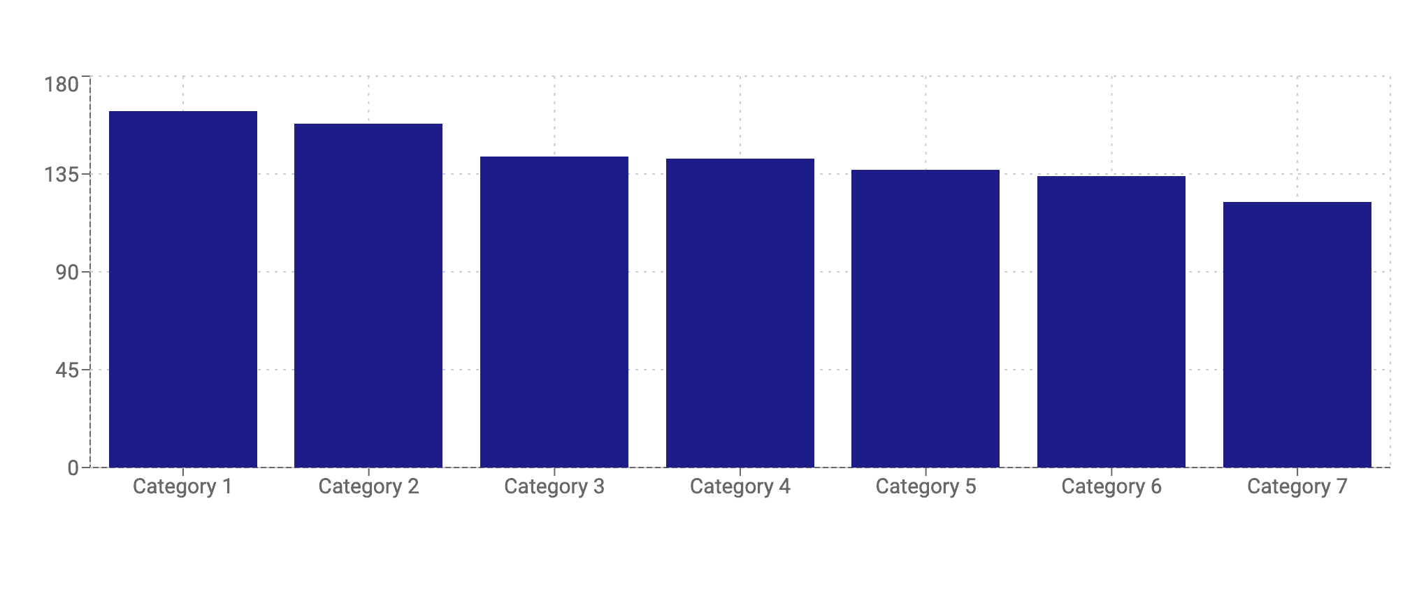
BarChart
<BarChart> renders an aggregation as a bar chart.
The default render shows vertical bars in a single colour #1e1c8a,
with category labels on the axis and a tooltip on hover.
| Prop | Required | Default | Description |
|---|---|---|---|
property | Yes | — | Thesaurus or select property to aggregate on, given as its lowercase internal name. |
dataset | No | default | Name of a declared dataset to read from; defaults to the dataset named default. |
context | No | System | Thesaurus context ID for label lookup. |
layout | No | horizontal | Bar orientation. horizontal (default) draws vertical bars; vertical draws horizontal bars. The value names the axis, not the bars. |
colors | No | #1e1c8a | Comma-separated hex colours, cycled across bars. |
classname | No | — | CSS class added to the wrapper. |
excludeZero | No | false | A value of true hides zero-count buckets. |
scatter | No | false | A value of true renders nested values as parent - label. |
maxCategories | No | 0 | Top-N count of categories to show, where 0 shows all. |
aggregateOthers | No | false | A value of true bundles the remaining categories into one "Others" bar. |
shortLabels | No | {} | JSON object mapping original labels to short display labels. |
sort | No | {} | JSON object with by and order keys. |
pluckCategories | No | [] | JSON array of labels to keep. |
Example:
<Dataset
  url="/library/?q=(allAggregations:!t,filters:(),from:0,includeUnpublished:!t,limit:1000,order:desc,sort:editDate,treatAs:number,types:!(%27685a1qw3erf45tghy50d4c69%27),unpublished:!t)"
  name="dataset1"
/>
<BarChart
  property="cetegories"
  dataset="dataset1"
  context="669w34rf56t5635ba73d11ca"
/>
The shortLabels object maps each full category label to a shorter label shown
on the axis.
The keys are the category labels as they appear on the chart.
The tooltip shows the full label on hover.
<BarChart
  property="measures"
  context="58ada3er45te8267485450fb"
  shortLabels='{"Provisional measures":"PM","Friendly settlements":"FS"}'
/>
PieChart
<PieChart> renders an aggregation as a pie or doughnut chart.
The default render shows a solid pie in a yellow palette starting at #ffcc00,
with a tooltip on hover and no slice labels.

| Prop | Required | Default | Description |
|---|---|---|---|
property | Yes | — | Thesaurus or select property to aggregate on, given as its lowercase internal name. |
dataset | No | default | Name of a declared dataset to read from; defaults to the dataset named default. |
context | No | System | Thesaurus context ID for label lookup. |
colors | No | #ffcc00,#ffd633,#ffe066,#ffeb99,#fff5cc | Comma-separated hex colours, cycled across slices. |
classname | No | — | CSS class added to the wrapper. |
innerRadius | No | 0 | Donut hole radius in pixels, where 0 is a solid pie. |
outerRadius | No | 105 | Outer radius in pixels. |
showLabel | No | false | A value of true shows percentage labels and hides the tooltip. |
scatter | No | false | A value of true renders nested values as parent - label. |
maxCategories | No | 0 | Top-N count of slices to show, where 0 shows all. |
aggregateOthers | No | false | A value of true bundles the remaining slices into one "Others" slice. |
pluckCategories | No | [] | JSON array of labels to keep. |
<PieChart> always excludes zero-count slices.
It has no attribute to change this.
Example:
<Dataset
  url="/library/?q=(allAggregations:!t,filters:(),from:0,includeUnpublished:!t,limit:1000,order:desc,sort:editDate,treatAs:number,types:!(%2769b85a47501qwe34rfa61372%27),unpublished:!t)"
  name="dataset2"
/>
<PieChart
  property="gender"
  dataset="dataset2"
  context="66ec1f9a01a01qw23er491802"
/>
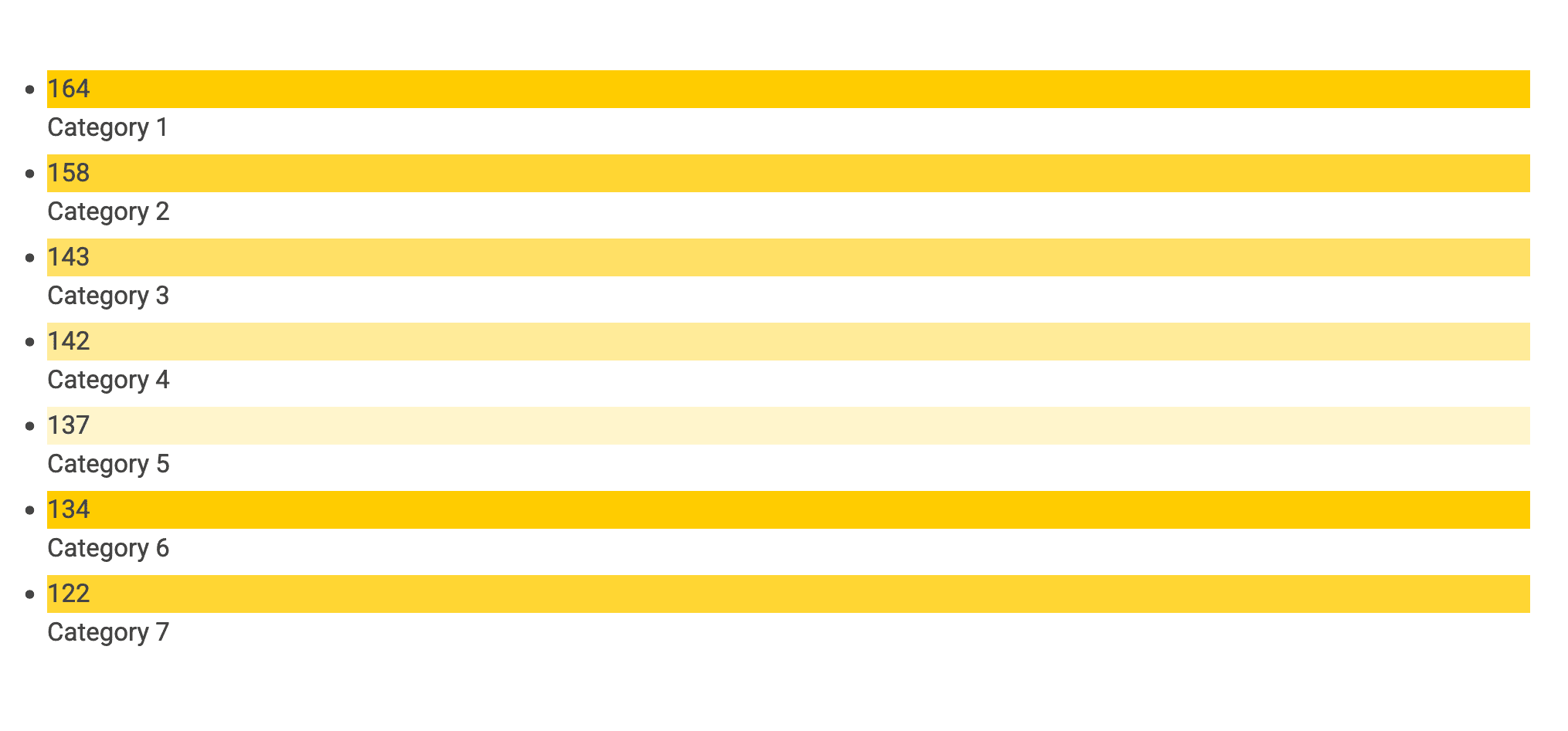
ListChart
<ListChart> renders an aggregation as a styled bullet list.
The default render shows a vertical list with a coloured square
and a count beside each label.
| Prop | Required | Default | Description |
|---|---|---|---|
property | Yes | — | Thesaurus or select property to aggregate on, given as its lowercase internal name. |
dataset | No | default | Name of a declared dataset to read from; defaults to the dataset named default. |
context | No | System | Thesaurus context ID for label lookup. |
colors | No | #ffcc00,#ffd633,#ffe066,#ffeb99,#fff5cc | Comma-separated hex colours, cycled across items. |
classname | No | — | CSS class added to the wrapper. |
excludeZero | No | false | A value of true hides zero-count items. |
scatter | No | false | A value of true renders nested values as parent - label. |
baseUrl | No | — | Library URL that turns each item into a filtered link. |
Example:
<Dataset
  url="/library/?q=(allAggregations:!t,filters:(),from:0,includeUnpublished:!t,limit:1000,order:desc,sort:editDate,treatAs:number,types:!(%27685a1qw1qw23er4ghy50d4c69%27),unpublished:!t)"
  name="dataset1"
/>
<ListChart
  property="selectgroup"
  dataset="dataset1"
  context="66ddfr416e5535ba73d11ca"
/>
FreeBarChart
<FreeBarChart> renders a bar chart from arbitrary JSON rather than a dataset
aggregation.
The default render shows vertical bars in a single colour #1e1c8a.

| Prop | Required | Default | Description |
|---|---|---|---|
data | No | — | JSON array of data objects, each with a label and one or more value keys. |
dataKeys | No | results | Which value key to plot. A key name, or a JSON array of {key: button label} objects to toggle between keys. |
colors | No | #1e1c8a | Comma-separated hex colours, cycled across bars. |
classname | No | — | CSS class added to the wrapper. |
layout | No | horizontal | Bar orientation. horizontal (default) draws vertical bars; vertical draws horizontal bars. The value names the axis, not the bars. |
children | No | — | Content rendered above the chart. |
Each data object can carry several value keys beside its label.
dataKeys selects which one to plot.
Pass a JSON array of {key: button label} objects to plot several keys:
the chart adds a toggle button per key,
and selecting one switches the plotted key.
The buttons appear only when the array has two or more entries.
Example:
<FreeBarChart
  data='[{"label":"col1","results":3,"otherProp":5},{"label":"col2","results":4,"otherProp":2},{"label":"col3","results":6,"otherProp":2}]'
  dataKeys='[{"results":"Results"},{"otherProp":"Other values"}]'
/>
This plots results by default and adds two toggle buttons,
"Results" and "Other values".
Selecting "Other values" re-plots the chart from the otherProp key.
Geolocation components
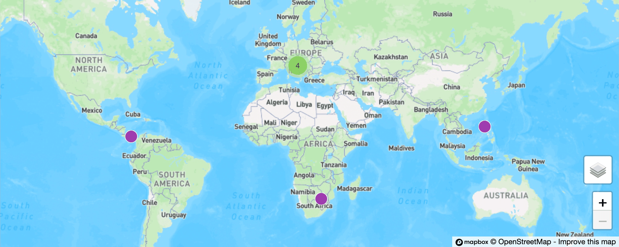
Map
<Map> plots entity locations from a geolocation dataset.
The default render shows a map at zoom level 6,
with markers and clusters for the entities that have coordinates.
| Prop | Required | Default | Description |
|---|---|---|---|
dataset | No | default | Name of a declared geolocation dataset; defaults to the dataset named default. |
classname | No | — | CSS class added to the wrapper. |
zoom | No | 6 | Initial zoom level. |
scrollZoom | No | — | A value of true enables zooming with the scroll wheel. |
showControls | No | — | A value of true shows the zoom controls. |
A map dataset needs the geolocation attribute set to true.
A bare geolocation dataset plots every published entity that has coordinates.
Example:
<Dataset
  name="places"
  geolocation="true"
  url="ibrary/?q=(allAggregations:!t,filters:(),from:0,includeUnpublished:!t,limit:30,order:desc,sort:creationDate,treatAs:number,types:!(%2766a11652we34rfc325b8b353%27),unpublished:!t)"
/>

<map dataset="places" zoom="7" showControls="true" />
Single-value components
These components each render a single value.
<Counter> and <Value> render it as inline text and show -
until the value resolves.
<GaugeChart> renders it as a semicircular gauge.
Counter
<Counter> renders a single aggregation count.

| Prop | Required | Default | Description |
|---|---|---|---|
property | No | — | Property to aggregate on, given as its lowercase internal name; absent, the count uses value. |
dataset | No | default | Name of a declared dataset to read from; defaults to the dataset named default. |
value | No | — | Aggregation key of the option to count, such as a thesaurus value ID or a template ID rather than its label; comma-separated keys are summed. |
uniqueValues | No | — | A value of true counts distinct non-zero buckets. |
The property also accepts the built-in _types and _published aggregations,
described under Charts.
Example:
<Dataset
  url="/library/?q=(allAggregations:!t,filters:(),from:0,includeUnpublished:!t,limit:1000,order:desc,sort:editDate,treatAs:number,types:!(%27685a83ec533b834af50d4c69%27),unpublished:!t)"
  name="dataset1"
/>

Number of entities:
<Counter
  dataset="dataset1"
  property="_types"
  value="685a83ec533b834af50sderf4"
/>
Value
<Value> renders one metadata value or one value from the page context.

| Prop | Required | Default | Description |
|---|---|---|---|
property | No | — | Metadata property to read from the named dataset, given as its lowercase internal name. |
dataset | No | default | Name of a declared dataset to read from when property is set; defaults to default. |
path | No | — | Dot path into the page context value when property is absent. |
<Value> has two modes.
The property mode reads a numeric value from a specific entity.
The path mode reads any value from the page context.
In property mode, declare the dataset with the entity attribute.
The value comes back as a number, so this mode doesn't render text values.
Example:
<Dataset entity="cvfxsqj93u" name="country" /> Country:
<Value path="country.title" />
In path mode, the dot path starts from one of the page context roots.
The entityRaw, entity, entityData,
and template roots exist only on an entity view page.
A dataset declared by name is a root on any page.
| Root | Holds |
|---|---|
entityRaw | The entity as stored, before formatting. |
entity | The formatted entity, with metadata keyed by property name and a value and label. |
entityData | A processed view, with formatted metadata and inherited relationships. |
template | The entity's template. |
| Dataset name | Any dataset declared on the page, such as an entity dataset read through path. |
A dataset-name root continues into that dataset's data. Root fields sit on the dataset. Metadata uses the property's internal name as its key and holds an array of value objects, so the path indexes into it.
Examples:
<Dataset entity="a1b2c3d4" name="cases" />

<Value path="cases.title" />
<Value path="cases.creationDate" />
<Value path="cases.metadata.type.0.value" />
<Value path="cases.metadata.type.0.displayValue" />
<Value path="entityRaw.title" />
<Value path="entity.metadata.type.value" />
<Value path="template.properties.4.label" />
GaugeChart
<GaugeChart> renders a single numeric metadata value as a semicircular gauge.
The default render shows a half circle with a #000099 fill on a grey #ccc
track, the value text in the centre, and a height of 110 pixels.

| Prop | Required | Default | Description |
|---|---|---|---|
property | Yes | — | Numeric metadata property to read the gauge value from, given as its lowercase internal name. |
max | No | 100 | Maximum scale value, applied when the attribute is absent or non-numeric. |
height | No | 110 | Gauge height in pixels, applied when the attribute is absent or non-numeric. |
dataset | No | — | Dataset to read the metadata value from. |
classname | No | — | CSS class added to the wrapper. |
colors | No | #000099,#ccc | Two comma-separated colours for the fill and the track. |
children | No | — | Centre text of the gauge; a child value component receives the dataset and property and renders the number between any prefix and suffix text. |
<GaugeChart> reads the first value of the property from the single entity
loaded into the named dataset.
Declare the dataset with the entity attribute,
since a search dataset carries no entity metadata.
Example:
<Dataset entity="f4lwed4e5qs" name="cases" />

<GaugeChart dataset="cases" property="some_number" max="100">
  <Value />%
</GaugeChart>
The <Value /> child receives the gauge's dataset and property, so the centre text reads as the value between the prefix and suffix, such as Progress 64%.
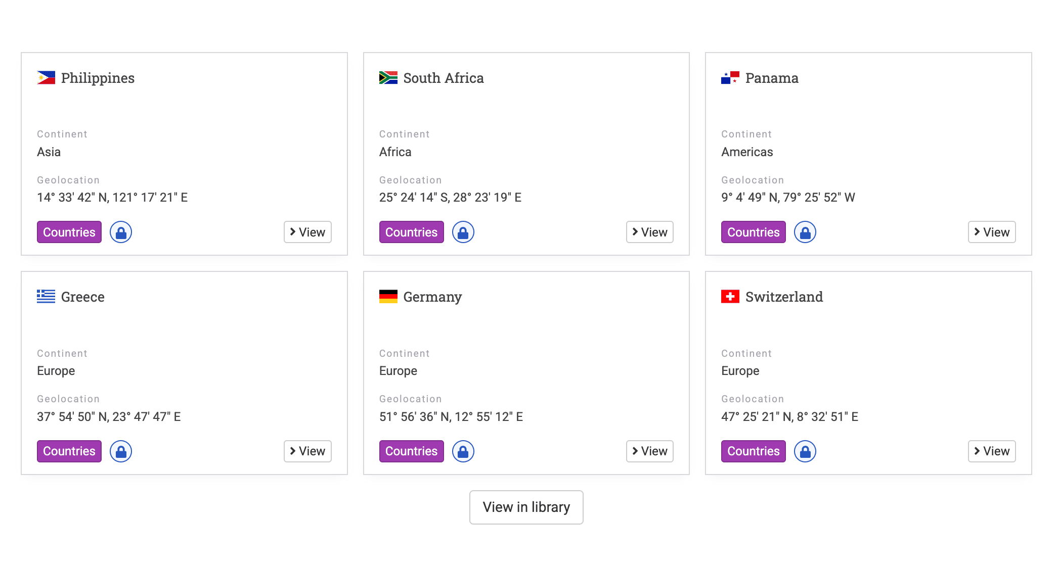
Entity view components
These components read the entity currently in view. They render on entity view pages.
EntityData
<EntityData> renders the value
or translated label of one property of the entity in view.
The default render shows inline text.
| Prop | Required | Default | Description |
|---|---|---|---|
value-of | Conditional | — | Property whose value renders. |
label-of | Conditional | — | Property whose translated label renders. |
Each tag needs exactly one of value-of or label-of.
The root values for value-of are title, creationDate, and editDate;
all other names resolve from entity metadata.
Examples:
<EntityData value-of="title" />
<EntityData value-of="creationDate" />
<EntityData value-of="Main Image" />
<EntityData label-of="title" />
EntitySection
<EntitySection> renders its children only when a query against the entity's metadata matches. The default render shows the children or nothing.
| Prop | Required | Default | Description |
|---|---|---|---|
show-if | Yes | — | JSON sift.js query applied to the entity metadata. |
children | Yes | — | Content rendered when the query matches. |
Examples:
<EntitySection show-if='{ "title": { "$exists": true }}'>...</EntitySection>
<EntitySection
  show-if='{ "metadata.description": { "$eq": "A long description" }}'
  >...</EntitySection
>
<EntitySection show-if='{ "metadata.inherited_text": { "$in": ["something"] }}'
  >...</EntitySection
>
Repeat
<Repeat> renders its children once per item in an array from the page context.
Each iteration sets the item as the new context.
| Prop | Required | Default | Description |
|---|---|---|---|
path | Yes | — | Dot path to the array in the current page context. |
children | Yes | — | Content repeated for each item. |
Example:
<Repeat path="entityRaw.metadata.pa_s">
  <li className="custom-list"><Value path="label" /></li>
</Repeat>
EntityLink
<EntityLink> wraps its children in a link to the entity in the current page context. It renders inside a <Repeat> block.
| Prop | Required | Default | Description |
|---|---|---|---|
children | No | — | Link label content. |
Example:
<EntityLink>View case</EntityLink>
EntityInfo
<EntityInfo> renders a clickable element that opens the entity detail side panel in the library.
| Prop | Required | Default | Description |
|---|---|---|---|
entity | No | — | The sharedId of the entity to open. |
tag | No | div | HTML element type to render. |
classname | No | — | CSS class added to the element. |
children | No | — | Content inside the element. |
Example:
<EntityInfo entity="abc123" tag="span">Open case</EntityInfo>
Lists, forms, media, and links
ItemList
<ItemList> renders a list of entity cards. An admin authors it with the legacy {list}(url)(options) brace syntax rather than an XML tag. The brace syntax works on HTML pages.
| Option | Default | Description |
|---|---|---|
limit | 6 | Maximum number of items to fetch. |
slider | — | A truthy value wraps the items in a carousel of three at a time. |
Example:
{list}(https://<yourdomain
  >/en/library/?q=(allAggregations:!f,filters:(),from:0,includeUnpublished:!t,limit:30,order:desc,sort:creationDate,treatAs:number,types:!(%2766a1165fw3edfr5t25b8b353%27),unpublished:!f))</yourdomain
>
SearchBox
<SearchBox> renders a search input that submits to the library.
The default render shows a single text input.

| Prop | Required | Default | Description |
|---|---|---|---|
placeholder | No | — | Placeholder text in the input. |
classname | No | — | CSS class added to the wrapper. |
Example:
<SearchBox placeholder="Search the collection" />
ContactForm
<ContactForm> renders a public contact form
that posts to the contact endpoint.
The default render shows name, email, message, and captcha fields.
It accepts no author-facing attributes.

Example:
<ContactForm />
PublicForm
<PublicForm> renders a public entity submission form for one template.
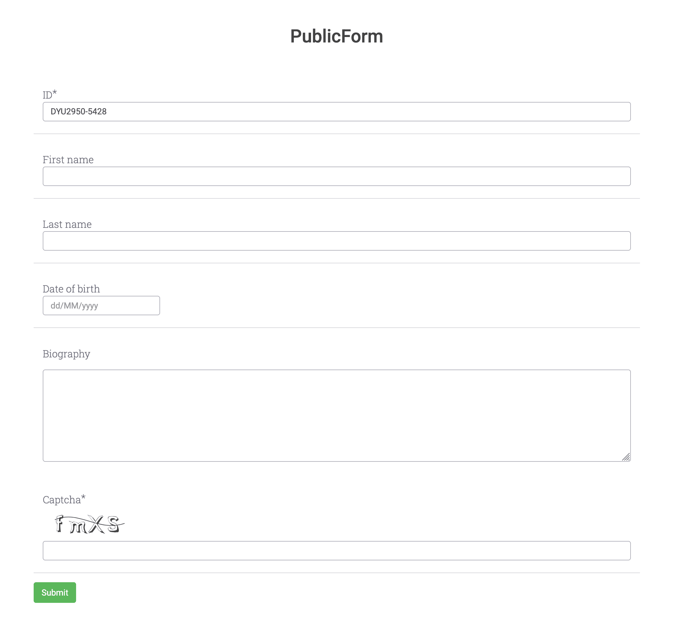
| Prop | Required | Default | Description |
|---|---|---|---|
template | Yes | — | Template _id the form submits to. |
file | No | — | The attribute's presence adds a PDF upload field. |
attachments | No | — | The attribute's presence adds an attachments field. |
remote | No | — | The attribute's presence uses remote captcha verification. |
Example:
<PublicForm template="544d7de00d342523edfr4568" file attachments />
MarkdownMedia
<MarkdownMedia> renders a video or audio player with optional time links. An admin authors it with the legacy {media}, {vimeo}, or {youtube} brace syntax rather than an XML tag. The brace syntax works on HTML pages.

| Prop | Required | Default | Description |
|---|---|---|---|
config | Yes | — | The (url, jsonOptions) string parsed for the URL and time links. |
compact | No | false | A value of true sets the player height to fill its container. |
Example:
youtube}(https://www.youtube.com/watch?v=K8yRxMLSFQA)
Slideshow
<Slideshow> renders an image gallery from its child elements.
The default render shows one slide at a time with auto-play on
and navigation arrows off.
| Prop | Required | Default | Description |
|---|---|---|---|
children | Yes | — | Child elements, each rendered as a slide. |
autoPlay | No | true | Autoplay flag, on by default; see the note on turning it off. |
showNav | No | false | Shows the previous and next arrows when set. |
showFullscreenButton | No | false | Shows the full-screen button when set. |
showPlayButton | No | false | Shows the play and pause button when set. |
classname | No | — | CSS class added to the gallery. |
The four boolean flags pass to the gallery without conversion.
Any non-empty value, including false, enables a flag.
An empty value, such as autoPlay="", or an omitted attribute disables it.
Because autoPlay defaults to on,
autoPlay="" is the only way to stop auto-play.
Every child node becomes a slide, including white-space. Place the image tags with no spaces or newlines between them, or the gaps render as blank slides.
Example:
<Slideshow showNav="true" autoPlay=""
  ><img src="/api/files/image-1.jpg" /><img src="/api/files/image-2.jpg" /><img
    src="/api/files/image-3.jpg"
/></Slideshow>
Link
<Link> renders a navigation link to an internal path or external URL.

| Prop | Required | Default | Description |
|---|---|---|---|
to | Yes | — | Destination path or URL. |
children | No | — | Link content. |
Example:
<Link to="/library">Browse the library</Link>
Icon
<Icon> renders a FontAwesome icon.

| Prop | Required | Default | Description |
|---|---|---|---|
icon | Yes | — | FontAwesome icon name. |
Example:
<Icon icon="users" />
Dataset query reference
Each visualization component reads from a dataset through one key. The key sets the data shape the component expects.
| Component | Reads | Returns |
|---|---|---|
Map | rows | Entity rows for map markers. |
BarChart, PieChart, ListChart | aggregations | Buckets for the named property. |
Counter | aggregations | A single count over the named bucket keys. |
Value, GaugeChart | metadata | One numeric metadata value. |
A <Counter> with value="id1,id2" sums the counts of both buckets.
Missing keys add 0.
A missing dataset returns an undefined value.
Charts and the map show a loading spinner,
and <Counter> and <Value> show -.
Runtime updates
Page JavaScript updates an existing dataset at runtime through
window.updatePageDatasets.
It only updates datasets already declared in the content,
and ignores unknown names.
window.updatePageDatasets('default', {
  rows: [],
  totalRows: 292,
  aggregations: { all: { tipo: { buckets: [] } } },
});
Dynamic property interpolation
Entity view pages support ${...} expressions in the raw content. Uwazi replaces each expression before it renders the page.
| Pattern | Resolves to |
|---|---|
${entity.title} | The entity title. |
${entity.sharedId} | The entity shared ID. |
${entity.metadata.prop} | The first value of the property. |
${entity.metadata.prop.value} | The first value of the property. |
${entity.metadata.prop.displayValue} | The first display value of the property. |
${entity.metadata.prop[N].displayValue} | The display value at index N. |
${template.name} | The template name. |
${template.properties.N.label} | The label of the property at index N. |
Uwazi leaves an unresolvable expression in place and reports it in the page errors.
Errors and edge cases
The table lists the conditions that affect how components render.
| Condition | Result |
|---|---|
| Dataset is missing or still loading | Charts and the map show a spinner; <Counter> and <Value> show -. |
| Dataset matches only unpublished entities for an anonymous visitor | The aggregation is empty, so a chart renders no bars. |
<EntityData> sets both value-of and label-of | The component renders nothing and logs an error. |
<EntityData> sets neither attribute | The component renders nothing and logs an error. |
<EntityData value-of> names a property that does not exist | The component renders nothing and logs an error. |
<EntitySection show-if> holds invalid JSON | The component renders nothing and logs an error. |
<PublicForm template> names a template that does not exist | The component fails with "The template is not valid". |
| An unsupported tag appears in admin content | Uwazi renders an "Invalid tag" error block. |
A ${...} expression cannot resolve | Uwazi keeps the text in place and reports a page error. |
Component errors appear only to signed-in admins and editors, never to public visitors, so a broken component on a public page stays silent.